The Choice Before the Click
How AI is transforming political imagery—and why the real decision belongs to the person using it-hopefully in an ethical manner.

Credit where credit is due, this idea for a Substack comes from Ann who is my editor and proofreader. She wanted to know how to stop someone we disagree with like Elon Musk and others from using AI to spread their viewpoints, especially using the amazing image creation ability - both in still illustrations and animations like how Trump posted a cartoon of an airplane dumping excrement on protestors. That got a lot of bad media coverage because it was so tasteless. In my limited way I am using your cartoons to make my Substacks more impactful. I don't know what Thom Hartmann image generator he uses but he also uses AI to illustrate some of his Substacks (recent examples are shown below).
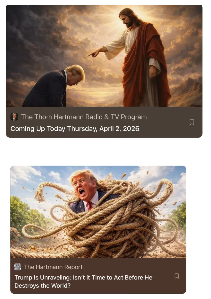
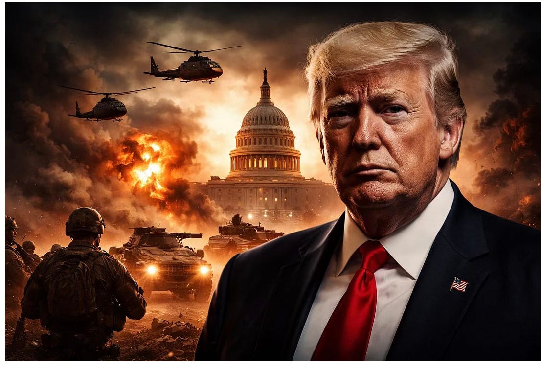
In his Substack today, Are Trump’s Purges and Calls for a Larger Military Budget the Setup for a Coup? As Trump demands sweeping new resources in the name of war, the scale of funding raises a chilling question: is this about national security or consolidating power?” Hartmann’s image (below) adds punch to his essay:
Of course he has a huge readership but, like with mine, it is 99.9% progressive.
I’ve been thinking about how people like Thom Hartmann, and others like me, can use AI to reach people already flooded with political imagery generated by the same tools. Which raises a simple question: what does responsible use of this technology actually look like?
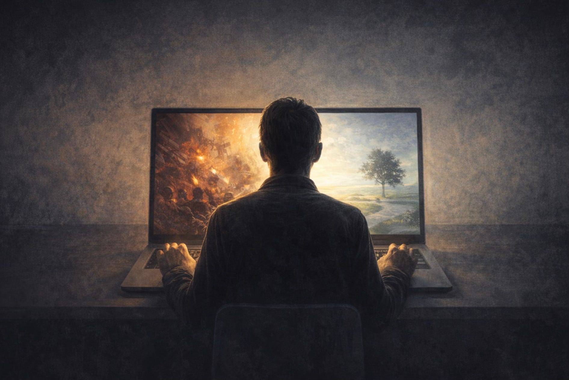
AI is becoming an amplifier. It can elevate insight—or it can industrialize insult. The difference isn’t the technology. It’s the intention behind it.
The same tools that can produce crude, attention-grabbing images in seconds can also be used to distill an idea into something clear, visual, and shareable. What matters is not what the machine can do, but what the person using it chooses to ask of it.
That’s what the image above is meant to suggest. The moment before creation is also a moment of decision. Do you aim for reaction, or for reflection? Do you try to overwhelm, or to clarify?
In my own small way, I’ve been using AI-generated illustrations to make these Substack essays more engaging—not to replace ideas, but to clarify them.
I want to be clear about something.
I use ChatGPT the way a writer uses a good editor: to help refine, organize, and sometimes challenge my thinking. But the ideas are mine, and the writing is mine. That matters to me, and I want it to matter to my readers as well.
The technology is now good enough to produce something that might sound like me—but isn’t. That’s a line I’m not interested in crossing.
For example, I once used ChatGPT to generate most of a piece asking whether AI could replace psychotherapists. I prompted it directly and let it respond. The result was more sophisticated than I expected—it even began to feel less like using a tool and more like consulting a colleague. It also generated the accompanying illustrations.

But those weren’t editorial cartoons of the kind I’ve been using recently. They showed what AI can do when it is essentially working on its own. That’s not what I want this Substack to be.
For most of modern history, editorial cartooning required the ability to draw. My parents subscribed to The New Yorker, and before I was old enough to appreciate the articles, I was captivated by the cartoons. My favorite cartoonist was Charles Addams, known for his dark humor and macabre characters.
I once aspired to be a cartoonist myself. I had ideas, but I wasn’t a good enough artist to bring them to life. One of my attempts—looking back, a pretty bad one—was a drawing of a decapitated head floating down a river singing “I ain’t got nobody.” That probably tells you something about both my limitations and my influences.
Now that the barrier of drawing skill is gone, anyone can create an image. But it should be obvious that this doesn’t mean everyone can create something worth seeing.
If anything, judgment matters more than ever.
Those of us using AI to create images have, in some ways, the same responsibility that editorial cartoonists always had. I would like to see people—especially those who share my values—hold themselves to a higher standard. Not everything that can be created should be. Shock value is easy. Thoughtfulness takes more effort.
I don’t want to be a propagandist. I want to be an honest and effective communicator.
I see my illustrations as adjuncts to my writing, not stand-alone statements. They should work in concert with the words. Not to be too flowery, but I think of them as instruments in an orchestra—supporting the piece, not drowning it out.
I won’t always get this right. But this is the standard I’m aiming for. If I miss the mark, I welcome feedback in the comments or by private message.
Afterthought: Cartooning could end up looking like this….
I want my images or images to serve the idea, not overwhelm it. Still, I do want to entertain, at least some of the time, and you can expect a certain bit of the Beta Brain bite in what I post.
Addendum:
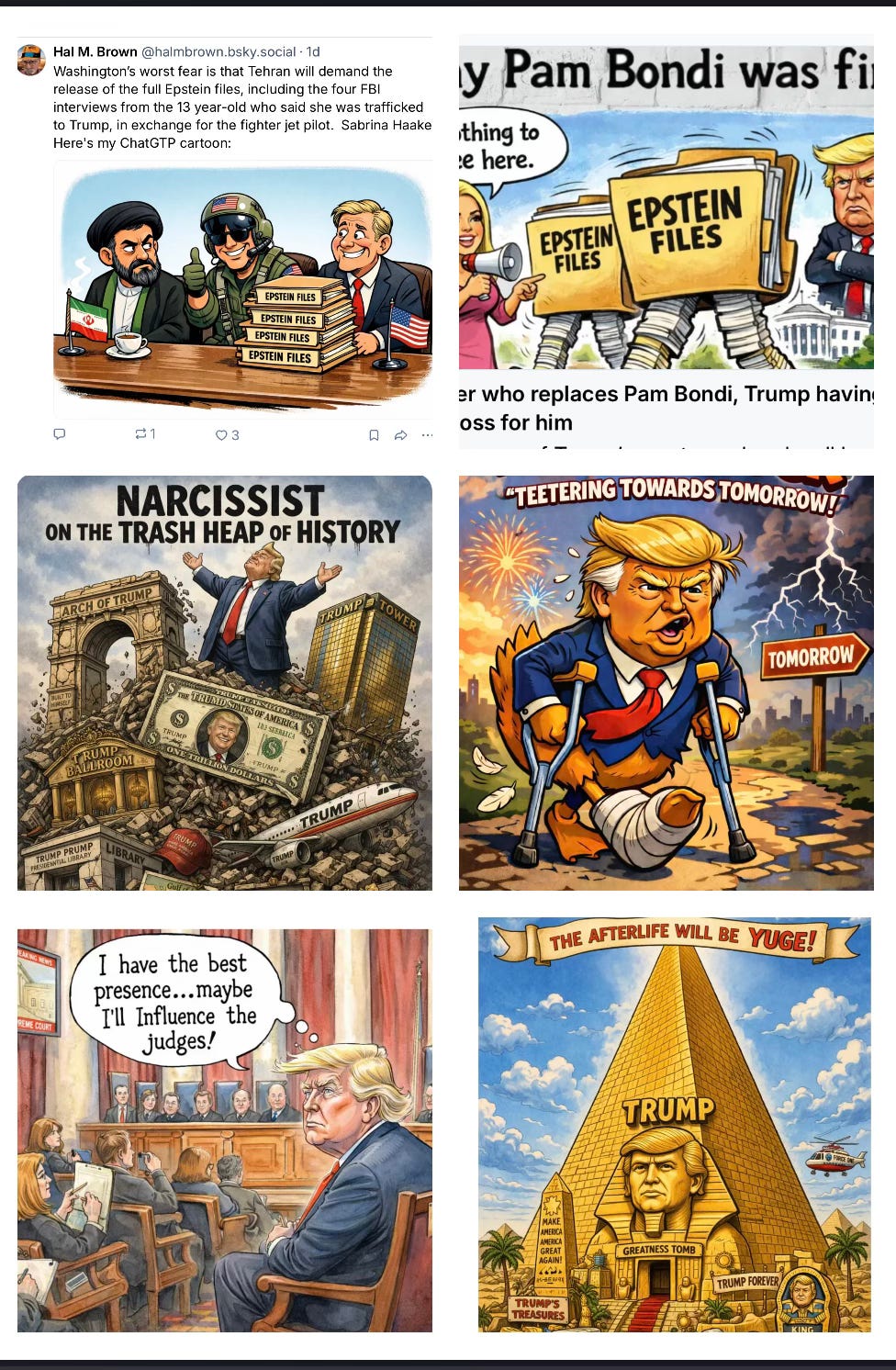
When I don’t have a Substack to use to go with an image sometimes I make one just to post on my BlueSky page. Here are some of them (click to enlarge).
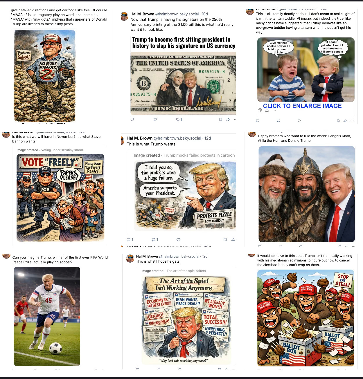
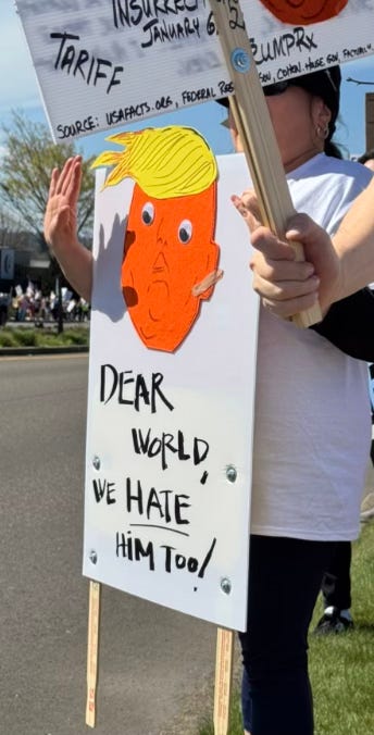
I want to use this new communication tool responsibly, but I also want to have fun with it. Trump is a megalomaniac who hates to be mocked. His adversaries know this which makes him vunerable because he is so reactive that if he singles anyone out he only give them publicity.
Protestors often makes signs playing on this. Below is one of my favorites from the No Kings protest we went to. Note the bandaid on his ear.

Footnote:
This isn’t about AI-generated images. It’s about something more basic: how Donald Trump presents himself visually, including his use of makeup. The intention may be to project a certain image, but perception doesn’t always follow intention—and the result is often widely remarked upon - and not in the way Trump would appreciate.
Query: I read sentences like this (which was in a Chauncey DeVega Salon column today): “Thick layers of make-up were unable to make Trump come across as anything but a tired old man...” and there are many other articles referencing Trump wearing make-up, usually excessively applied. Is there any proof he does wear make-up? If so has anybody credibly reported that, if he does, whether he applies it himself or has a make-up artist who applies it?
Short answer: yes—there is credible evidence that Donald Trump uses makeup in at least some situations, but the details (how much, what kind, and who applies it) are partly confirmed, partly reported, and partly speculative. Here’s a clean breakdown separating those levels.
✅ What is clearly confirmed (by Trump himself or solid reporting)
1. He does use makeup—at least for specific purposes
Trump has personally acknowledged applying makeup to cover cuts or bruises, especially on his hands.
He described it as quick and simple: something he can apply in “about 10 seconds.”
👉 This is the strongest, direct evidence: not speculation, but his own admission.
2. Makeup on his hands has been repeatedly observed
Journalists and photos have shown visible foundation/concealer on his hands during public appearances.
This has been noted across multiple events and explained (by him and aides) as covering bruising.
👉 This reinforces that cosmetic use is real and visible, not just rumor.
🟡 What is widely reported but less definitively proven
3. He likely uses facial cosmetics (foundation/bronzer)
His distinctive “orange” or “bronzed” look has been discussed for years by:
dermatologists
makeup artists
journalists
Some reporting and insider accounts say he uses:
translucent powder or foundation
possibly self-tanning products
👉 Important nuance:
Experts infer this from appearance (tone mismatch, coverage patterns),
but there is no single definitive on-record confirmation of a full facial routine from Trump himself.
4. There’s credible reporting he applies it himself
Former White House communications director Stephanie Grisham said Trump does his own makeup.
Older reporting (e.g., Vanity Fair) similarly described him as handling his own appearance.
👉 This is one of the more consistent insider claims.
🔴 What has not been proven (despite lots of commentary)
5. No solid evidence of a regular makeup artist
Unlike TV anchors or many politicians, there is no widely confirmed, consistent makeup artistassigned to him.
In fact, the strongest reporting suggests the opposite: he prefers to do it himself.
6. No photographic “proof” of him being made up
As one report noted, it’s surprisingly hard to find a photo of him actually having makeup applied.
That absence fuels speculation but also shows how private his routine is.
🧠 Why you keep seeing lines like the one you quoted
Writers (like Chauncey DeVega) often describe “thick layers of makeup” because:
His skin tone often appears visibly different from his hands/ears
There are sometimes sharp demarcation lines (a classic sign of applied product)
Lighting and camera conditions exaggerate this effect
But those descriptions are usually:
interpretive / rhetorical, not based on direct reporting of application
🧾 Bottom line
✔️ Confirmed: Trump uses makeup in at least some cases (especially to cover bruises), and he has said so himself.
✔️ Credibly reported: He likely applies at least some of it himself, not via a regular makeup artist.
🟡 Strongly inferred: He uses facial cosmetics (foundation/bronzer/tanner), based on consistent visual evidence and expert commentary.
❌ Not proven: A detailed, fully documented “routine” or professional makeup team.
If you want, I can break down why his look reads as “too much makeup” to viewers—there are actually a few very specific technical reasons (tone mismatch, undertones, lighting choices) that explain that perception really well.
break down why his look reads as “too much makeup” to viewers—there are actually a few very specific technical reasons (tone mismatch, undertones, lighting choices) that explain that perception really well.
Absolutely—this is where it gets really interesting, because what people read as “too much makeup” is often less about quantity and more about how it interacts with lighting, skin tone, and camera optics. Here are the key technical reasons his look registers so strongly to viewers:
🎨 1. Tone mismatch (face vs. rest of body)


This is the biggest visual trigger.
His face often appears more saturated (orange/bronze) than:
ears
neck
hands
👉 The human brain is extremely sensitive to skin-tone continuity.
Even a small mismatch reads as “artificial.”
Why it stands out with him:
The contrast is often not subtle
It creates a mask-like effect, especially along the jawline
🌈 2. Undertone clash (orange vs. pink/neutral skin)


Skin tone isn’t just light/dark—it has undertones:
cool (pink/blue)
warm (yellow/golden)
neutral
👉 Trump’s natural complexion appears cooler/pinker,
while his facial color often reads very warm/orange.
Result:
The color doesn’t just look darker—it looks “off”
Our brains interpret that as cosmetic rather than natural
💡 3. Studio lighting exaggerates everything


Television lighting is brutal:
Bright, frontal lighting flattens features
It amplifies color saturation
It highlights edges and uneven blending
👉 Makeup that looks fine in a mirror can look:
heavier
patchier
more orange
on camera.
📺 4. HD cameras reveal texture and layering


Modern cameras (especially HD/4K):
Pick up pores, lines, and product buildup
Reveal layering (powder over cream, etc.)
👉 This can create:
a slightly “cakey” or matte-heavy look
visible product sitting on top of skin
Even moderate makeup can look heavier than intended.
🧱 5. Sharp edges instead of gradual blending


Well-blended makeup fades gradually.
What viewers often notice in his case:
distinct borders near hairline or jaw
uneven transitions across the face
👉 Hard edges = instant signal of “applied product”
🌞 6. Possible use of bronzer or self-tanner


If bronzer or tanning products are involved:
They tend to skew orange under artificial light
They can apply unevenly over time
👉 Combined with foundation, this can:
intensify the color
create layered tones rather than a natural gradient
🧠 7. Psychological contrast: expectation vs. reality
This one’s subtle but powerful:
Viewers expect a political figure to look “natural” or minimally styled
When the face reads as stylized, it feels out of place
👉 That mismatch amplifies perception:
“This is too much”
even if the actual product amount isn’t extreme
🧾 The bottom line
What people interpret as “too much makeup” is usually a combination of:
Color mismatch (face vs. body)
Undertone conflict (orange vs. pink)
Lighting amplification
High-definition detail
Visible blending lines
Put together, these create a “mask effect”—and that’s what viewers are reacting to.
If you want, I can take a specific recent photo and walk through exactly which of these factors are showing up and where—it’s almost like doing a visual forensic analysis, and it can get surprisingly precise.
This is what DeVega story used:
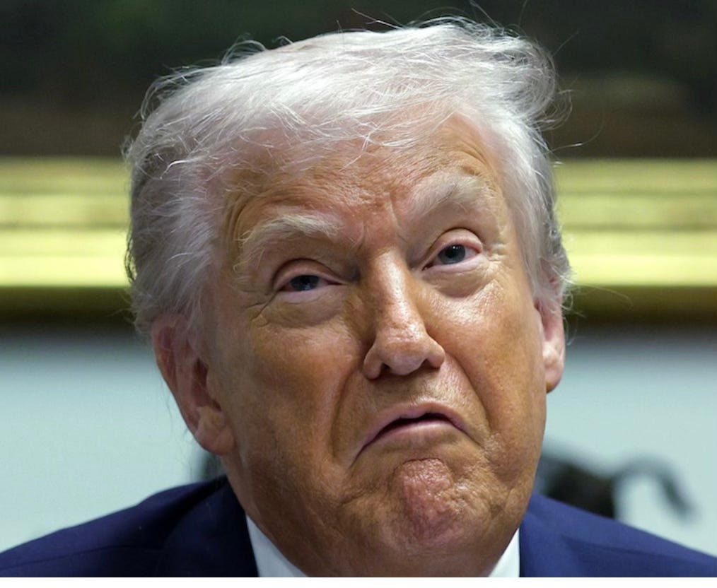
Great example to analyze—this image really concentrates several of the effects we were talking about into one frame. Let’s walk through it like a visual “forensic read,” focusing only on what’s observable.
🎯 1. Strong face vs. hair contrast
The hair appears very light (white/gray)
The face appears deeply saturated (orange/bronze)
👉 This creates immediate high contrast at the hairline, which the eye reads as:
“The color on the face is applied rather than continuous.”
This is one of the fastest triggers for the “makeup” impression.
🎨 2. Uneven color distribution across the face
Look closely at different zones:
Cheeks and lower face → most saturated/orange
Forehead → slightly less intense
Around the eyes → noticeably lighter and more natural
👉 That variation suggests:
either layered product or
uneven coverage / blending
The lighter eye area, in particular, creates a kind of “reverse mask” effect—instead of eyes being highlighted, they look recessed relative to the surrounding tone.
🌈 3. Undertone clash (very visible here)
The face reads warm/orange
The visible skin near the eyes and hairline reads cooler/pinkish
👉 That clash is especially noticeable in:
the upper cheek near the eye socket
the temple area
This is exactly the kind of mismatch that makes viewers think:
“Something about this color isn’t natural skin.”
🧱 4. Texture + product sitting on the skin
This image is sharp enough to show:
fine lines around the mouth and eyes
slight unevenness in how light reflects across the cheeks
👉 What that suggests visually:
a matte or semi-matte layer on top of skin
product that’s not fully integrated into natural skin texture
This contributes to the “heaviness” perception—even if the actual amount isn’t extreme.
💡 5. Lighting amplifies the effect
This appears to be indoor, overhead/forward lighting (likely office or press setting):
It creates specular highlights (shiny spots) on the cheeks and nose
It deepens shadows under the eyes
👉 Result:
the orange tone becomes more saturated
the texture becomes more visible
the contrast between areas becomes harsher
Lighting alone can make moderate makeup look much heavier.
✂️ 6. Subtle but important: edge transitions
Look at:
the area near the hairline
the outer cheek toward the ear
👉 You can see slight shifts in tone rather than a perfectly smooth gradient
Not a dramatic line—but enough that the eye detects:
“This isn’t one continuous skin tone.”
That’s all it takes.
🧠 7. Expression + framing amplify perception
This is an underrated factor:
The expression (downturned mouth, raised chin)
Tight crop on the face
👉 These emphasize:
lower-face texture
color saturation in the cheeks and chin
So the viewer’s attention is pulled exactly to the areas where the color is strongest.
🧾 Putting it all together
What makes this image read as “heavy makeup” isn’t one thing—it’s the stacking of multiple small signals:
Strong contrast with white hair
Orange vs. pink undertone conflict
Uneven distribution across facial zones
Visible texture under HD conditions
Lighting that boosts saturation
Slight blending inconsistencies
👉 Combined, these create what your brain interprets as:
a “mask effect” rather than natural skin.
SEO, search engine optimization, was a big deal early in the Internet's history. Google, Yahoo, Ask Jeeves (?) AOL, and others competed for users. There were "directories" and "search engines".
Cheat sheets for search queries were available. I still have a Google Shortcuts sheet. Yahoo had a magazine. PAPER PUBLICATION.
SEO still exists, I think. AI is the newest example of SEO.
For a dangerous entity, AI, provides much search benefit. SEO may not become self-aware. For AI, it's just time and LLM training as to when your AI will roust you out the door to work at some human labor-intensive tasks. Agricultural stoop labor comes to mind. No need for the cluttered brains of humanity.
"Internal Affairs" operatives will follow you on the MBTA; AI already knows the station at which you will detrain.
Maybe it's too early for the "darkness" potential be given a name. BUT THE DAY IS YOUNG.
Moral compass AI training and " Do No Harm" programming might convince nay sayers (me) AI is not a threat. MAYBE.
Tommy
Case in point, maybe? This unknown, DM, had a common name. of Joseph. I let my emotional guard down, when he said he was an Ukrainian soldier, one with a tragic history of wife being killed at Bucha,; so he sent his daughter out of the Country to live with close friend to be safe. The second message sent was a picture of a soldier straight out of Gentlemen Quarterly; and asked for my pic in return. No, thanks. Bad vibes. Fairly certain this picture was AI.
Danger online, Will Robinson.